FLYKNIT X MUJI 無印良品
IAT 338: Interactive Objects & Environments
Nga La, Aslan Law, Sammi Leung, Bruce Lui
Nike’s Flyknit is a cutting edge design that uses a new micro engineering technique that allows Flyknit to become so lightweight that it becomes a “second skin” to the “foot in motion”. Our goal was to design products that integrated concepts from Nike’s form fitting technology for our client, MUJI. My role for this project included research, framework creation, concept ideation, and asset (illustrations and content) preparation.
THE BRIEF
Incorporating the idea of adaptive support into our design
Nike took inspiration from cable bridges and the way that the cables provide enough structure to hold up the load of the bridge, yet flexible enough to stay balanced and adapt to wind forces. This is reflected in Flyknit as parts are knitted more dense so that it provides support for the ergonomics of running. Inspired by that, we got the opening of “adaptive support” for our project, which represents the flexibility of the form in order to adapt to people and the way they use it, yet at the same time maintaining enough structure to support the form.
THE PROCESS
Our client MUJI is simplicity, but simplicity through complexity of thought and design
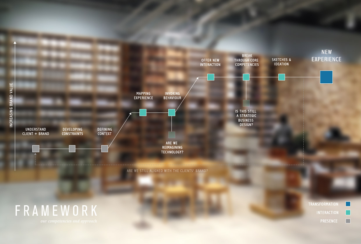
Our approach included defining and understanding the client and context so that our design can break through core competencies and invoke new behaviour and interactions in users. Along the way, we also considered if our idea was reimagining technology and whether it was a strategic design from the business perspective.
We were designing for MUJI and wanted our design to resonate with its focus of bringing products to its simplest form with a sense of “emptiness” so that it can speak to different people. Fkyknit was successfully because it is a flexible, yet structurally supportive design. We wanted to integrate this concept of adaptive support into our products, and create “empty containers” that adapt to the different meanings people put to it, while offering support as a product of everyday life.
THE DESIGN
Everyday objects that offer natural movement through form and affordances
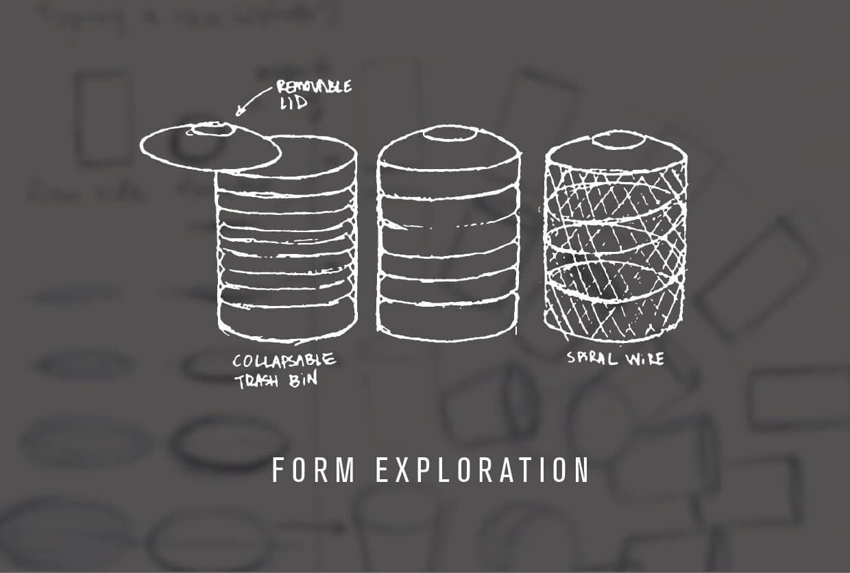
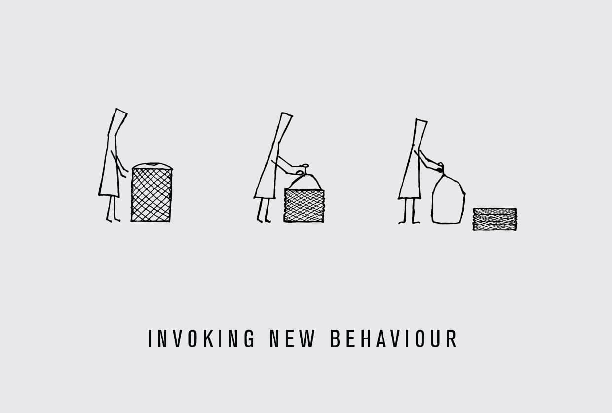
For janitorial staff, there are ergonomic hazards in repetitive actions of lifting heavy garbage out of trash cans, due to exertions on muscles and joints. We took this as an opportunity to invoke behaviour in a way that offers a new interaction. The outcome is a form that oscillates from a structured expanded state to a compact state. This design enables garbage to be lifted out at a lower height, which minimizes the load on joints and affords the opportunity of creating a more natural interaction. Our trash can is made from an interlocking skeleton of collapsing edges that has the ability of forming a concrete structure, which reinforces the notion of a lightweight and flexible design.
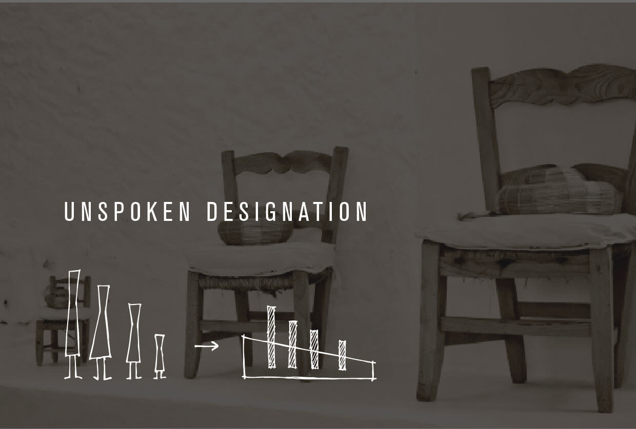
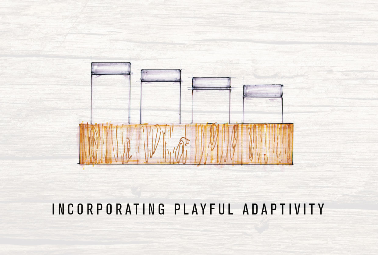
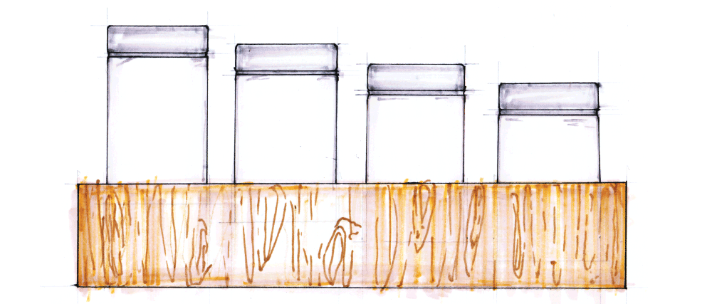
Our second design was inspired by the idea of “unspoken designation” that exists within households. The set of jars we designed has a sloping height that creates a subtle visual adaptation. This implies that the most revealed jar is also the one that gets used most, therefore creating a hierarchy in the pattern of how much an individual uses the contents of each container.
