ISAP WEBSITE REDESIGN
SFU ISS: Design and Marketing Intern
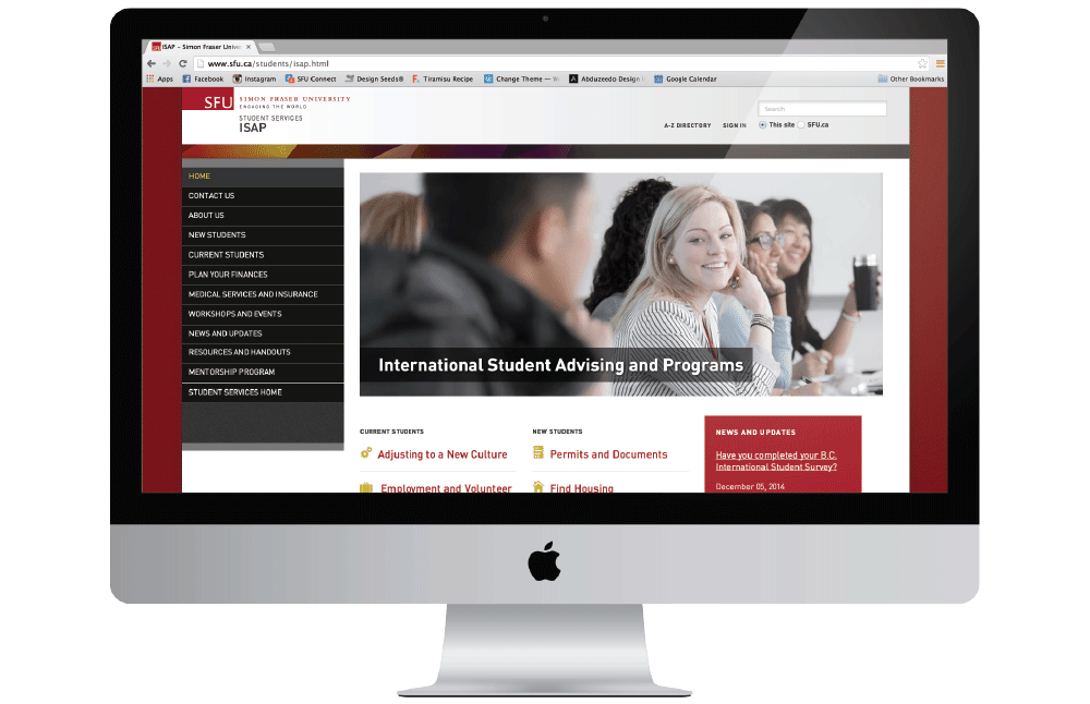
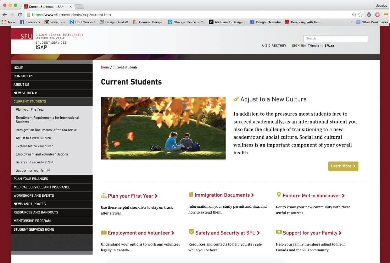
As the Design and Marketing intern for the International Services for Students department at Simon Fraser University, the biggest project that I took on was the redesign of the ISAP website, which was part of SFU's Common Look and Feel project. Together with the Systems and Web consultant, we consolidated the website's branding and streamlined content to enhance the user experience for both first-time and frequent visitors. Specifically, I was in charge of organizing the content inventory and site map, creating rapid wireframes, and preparing assets for the website, such as photos and icons.
THE PROBLEM
Inconsistent branding, unclear information hierarchy, repetitive content
SFU’s organizational units are diverse and distinctive, yet they are all part of an institution with shared values. Every time members of SFU communicate with the public, they influence the school’s reputation and shape its brand. However, because every subunit works independently, this has resulted in a number of websites that are inconsistent with the core SFU brand and with each other. As well, because there is no designated point person for managing the assets on the ISAP website, it has resulted in repetitive content that are hidden in buried layers.
THE PROCESS
Develop a content driven website that was aesthetically pleasing
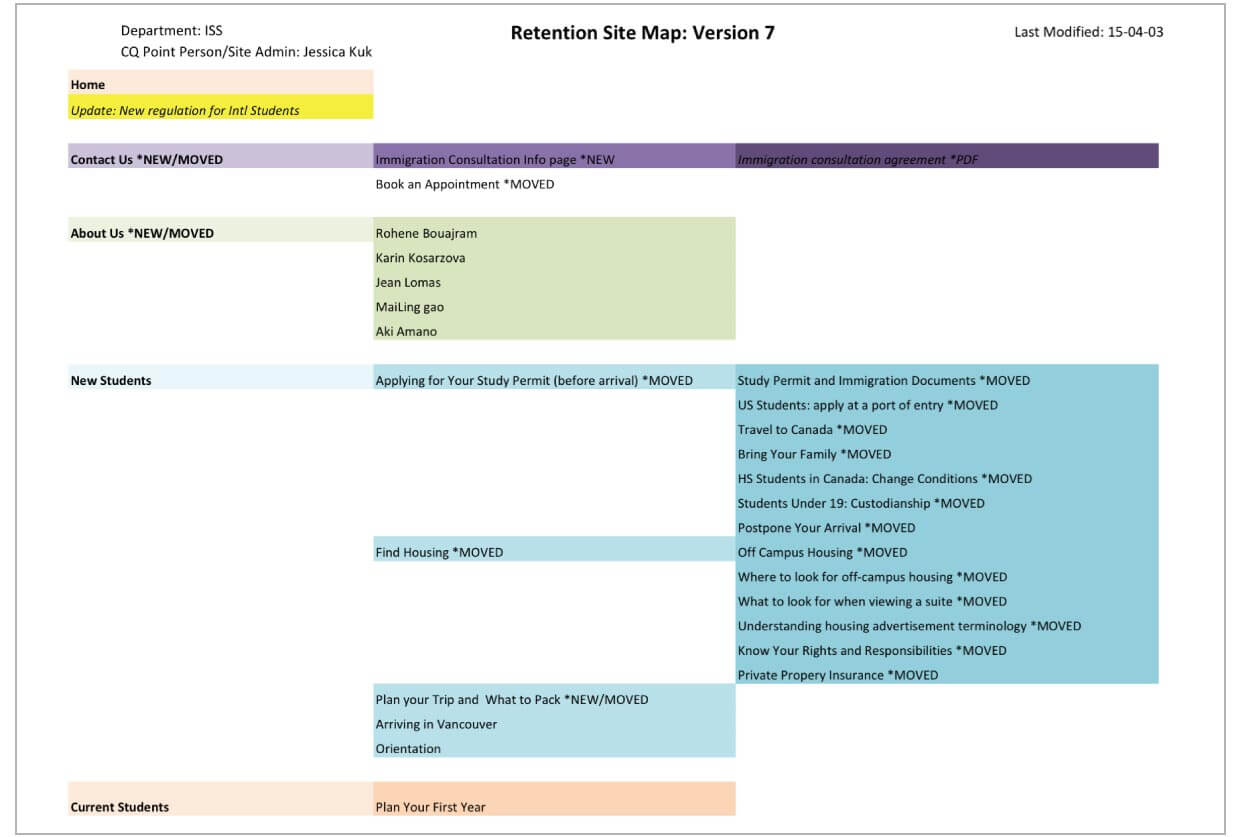
The process of redesigning the website involved working with the Systems and Web consultant from SFU’s Communications Services. This meant content generation and streamlining information so that it is more easily accessible and understood by users, especially international students. To figure out what pages were visited most frequently and what information users valued, google analytics was used. Afterwards, content inventories were created and revisited numerous times, and site maps where organized to develop better information architecture.
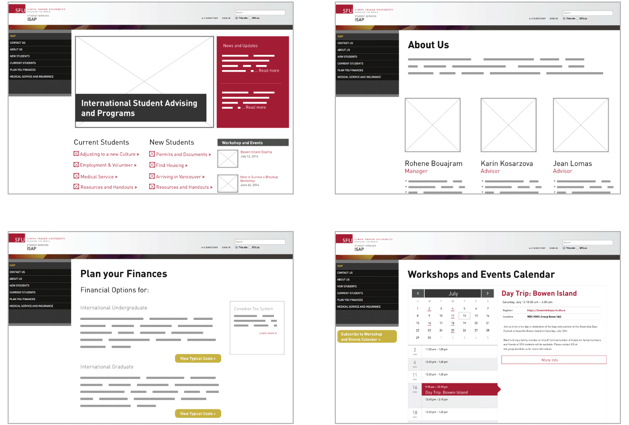
At this point, I worked on wireframes of low and high fidelity for the redesign. To do so, I had to study other SFU websites that were also part of the Common Look and Feel project to ensure that my design was consistent with theirs. I also revisted and modified the branding of the ISAP website to ensure that it was aligned with the overall SFU brand.
THE OUTOME
Increased the traffic on the ISAP website by 37%
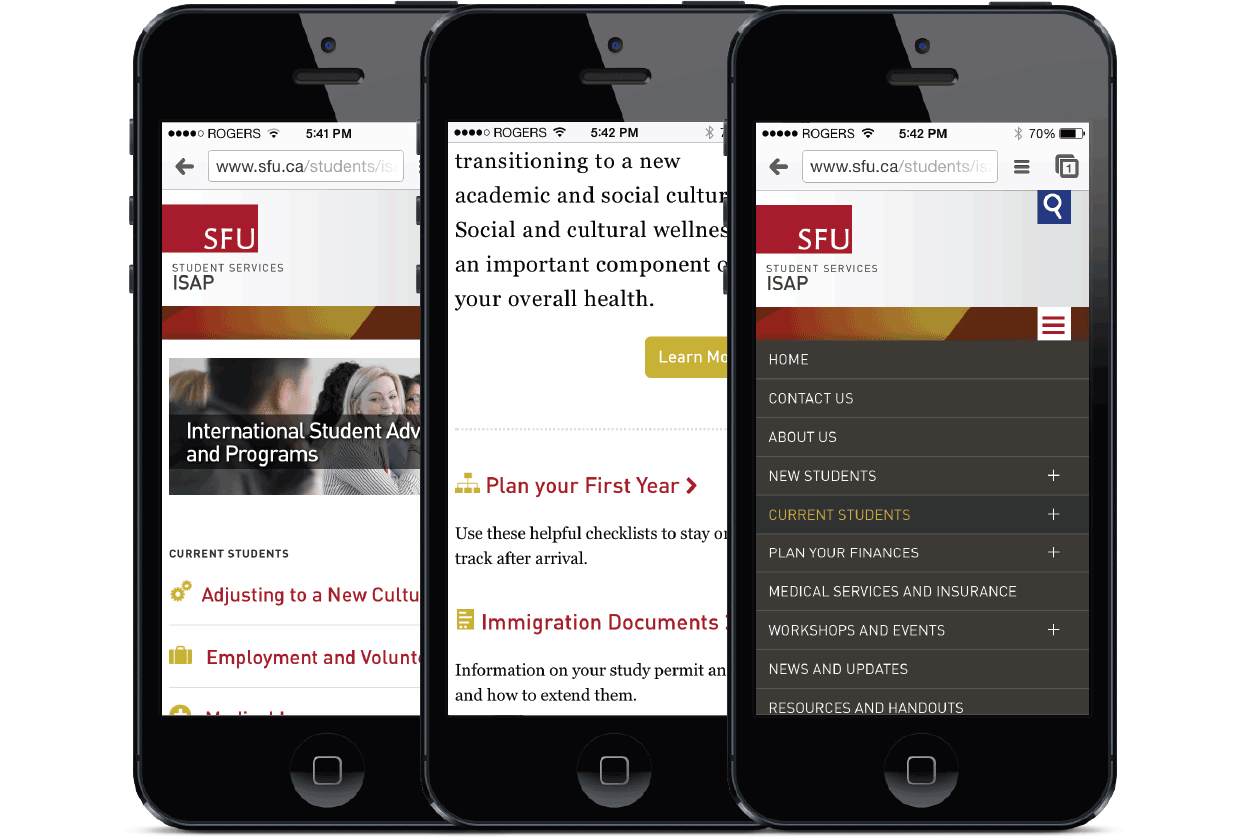
Redesigning a corporate website was not an easy thing, but the result was a responsive design that was true to the SFU brand and equally easy to use and find information on various devices. Working on this project has taught me how to voice my opinion, especially in a setting where I am the only “design expert”. It also presented me with the challenge of working in an unfamiliar media (web), but the positive feedback from my director and other subunits at SFU has made this a fun, yet humbling experience.
