ETCHED ON WEB DESIGN
IAT 339: Web Design & Development
Nicky Fung
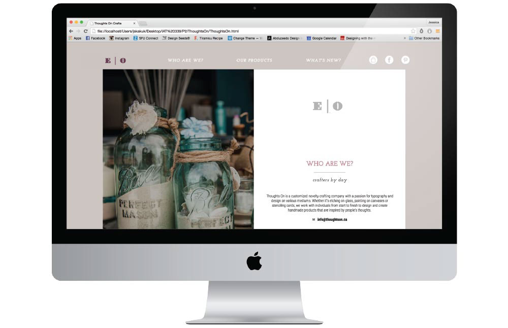
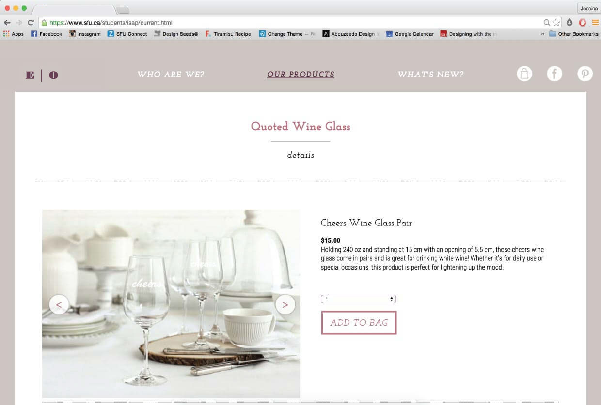
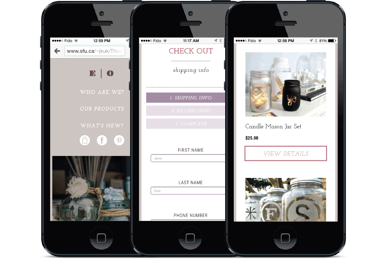
As a project for a web design and development course, we worked in teams of two to design and code a fully functional website for a particular company. Specifically, I worked on the branding of the website to ensure that it is consistent with the look and feel of the company, and created a style guide; I also created wireframes for different platforms before my partner and I began coding and consolidating the content.
THE BRIEF
Creating a consistent online presence for the company
Etched On is a customized novelty crafting company with a passion for typography and design on various mediums. Because there is no physical store and sales are made through personal selling and word of mouth, an online presence becomes crucial as it is one of the few ways that potential customers can get more information. Talking with our clients, what they wanted was a responsive website with a branding that shows off the artisanal and delicate nature of their business.
THE PROCESS
Actualizing a minimalistic, delicate, yet contemporary look and feel
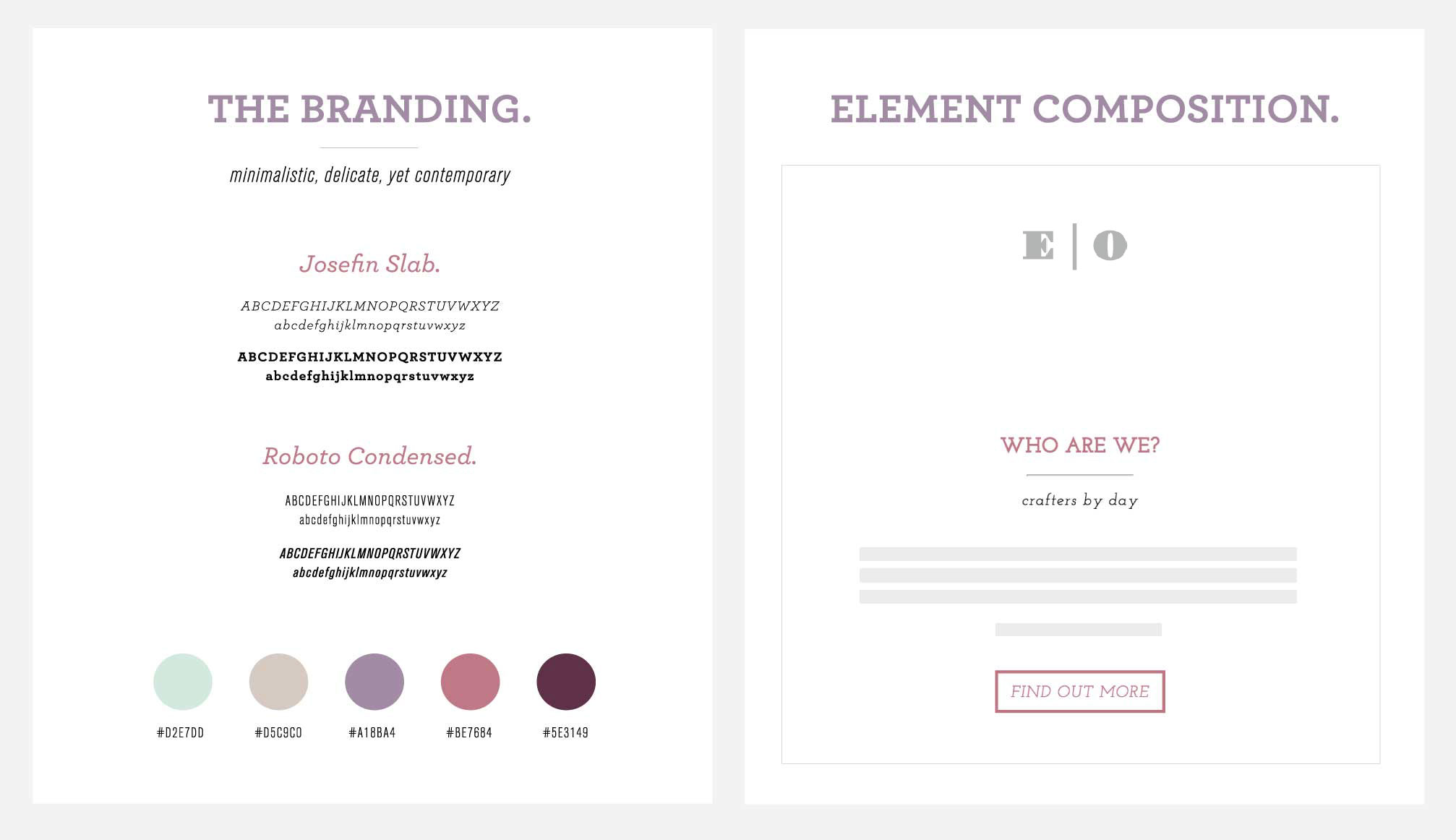
The process of designing the website involved coming up with an appropriate branding and then creating a digital style guide so that we can ensure that elements are styled in a coherent way. The brand that we decided to go with was a minimalistic, delicate, yet contemporary look and feel, with the use of fallen color tones.
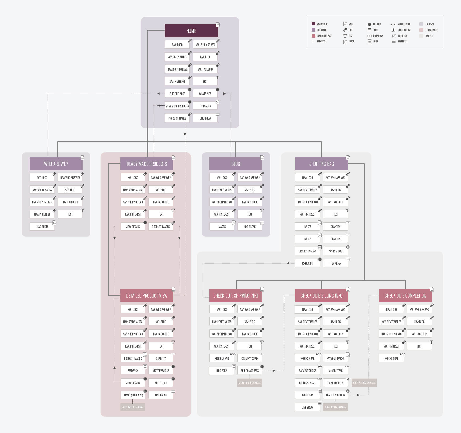
At this point, a sitemap was made so that we can visually and textually organize the website’s content and determine whether discussed navigation paths between different pages make sense. We also streamlined our content to ensure that they matched the sitemap.
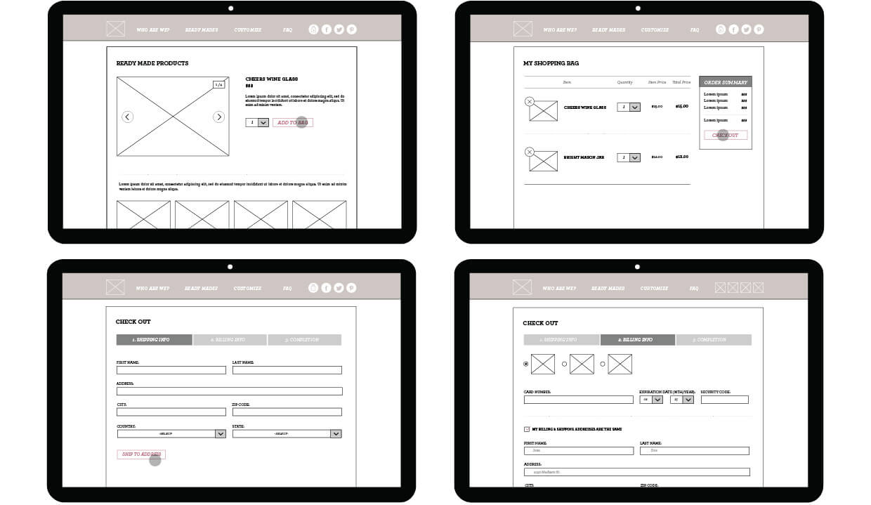
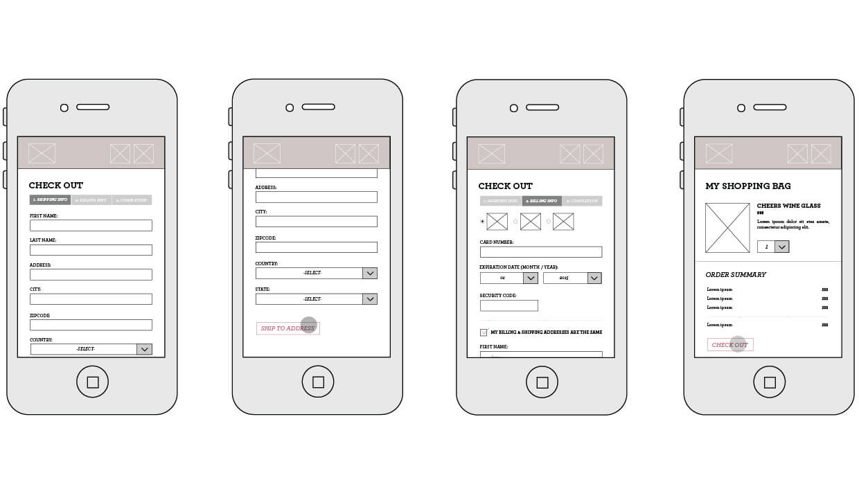
Afterwards, I worked on wireframes of high fidelity for different screen sizes, as one of our goals was to make this a highly responsive design. My partner and I then began coding the website, using GitHub as we passed files and shared codes through this repository hosting service.
THE OUTOME
Fully functional website with a brand identity that is reflective of Etched On
Designing a website for a startup company proved to be difficult, but in the end, we were able to reach our goal of creating a fully functional website with an online presence that reflected Etched On’s brand identity. Working on this project gave me the opportunity to work with real clients and that has taught me how to pitch my ideas in a professional manner. It has also allowed me to learn how to be open to changes, but stand my ground if asked to make modifications that I didn’t see fit. In the end, the clients were more than happy with the design and is in the process of making the website live.
